Dialogues is a repository for words and images produced by Illustration Animation students at Kingston School of Art. Read new content at dialogues.network
A model is never only a method. It is a memory of form that has forgotten its history. It appears instructional, procedural, pragmatic—but it is also ideological. A model distills prior conditions into something that can be transferred, repeated, and applied. Yet in doing so, it risks detaching form from its conditions, converting it into a kind of floating logic. In this sense, every model is a residue of form that has been made to stand in for thinking—a fetish of structure, animated by use, yet hollowed of origin.
Design models—whether pedagogical templates, workflow diagrams, typographic systems, or layout conventions—rarely present themselves as historical. They offer themselves as tools, not as traces. But these tools carry the sediment of past social arrangements: the division of labour, the institutionalisation of design, the economisation of attention. What persists is not just method, but the ideological remnant of fetishised form—a form that has come to appear autonomous, necessary, even efficient, precisely because its origins have been obscured.
This issue of Dialogues takes the model not as a solution to be adopted nor a constraint to be resisted, but as a site of dialectical engagement. That is, a site where contradiction is not resolved but revealed—where the inherited, the habitual, and the contingent are brought into conversation with new demands, new questions, new formations of practice.
Across typography, publishing, image-making, and social design, the contributions here approach modelling not as a means of simplification, but as a way of organising attention. Some interrogate existing structures; others construct new ones. Some remain within received systems, working slowly through their frictions. Others break open forms to see what they conceal. In each case, the model becomes a mode of reflection—not an answer, but a question formed in practice.
This is not the subversion of models for the sake of difference. It is something slower and more exacting: a pedagogy that holds inherited forms in view, traces their construction, and works within them long enough to transform them. In this light, practice is not framed as innovation, but as fidelity to process—to the conditions of making, the demands of form, and the relations through which design becomes possible.
To model, in this expanded sense, is not merely to (re)produce structure, but to participate in a dialectic of constraint and transformation. Every model is a fragment of a longer process. It carries the weight of its emergence, and the possibility of its revision. If the fetish of form closes history into appearance, then the task of education is not to dismiss the model, but to rework it—consciously, collectively, and critically.
This issue offers such reworkings. Not as finished frameworks, but as material attempts to think, teach, and make.
Marcus Leis Allion is a typographer, educator, and researcher. His work spans critical pedagogy, poetics of aesthetics, and the historical materialism of visual culture.
Publishing
Jonas Berthod and Matthew Stuart
In its widest definition, graphic design’s main concern is to make public. Accordingly, our strand understands publishing in its etymological sense as the act of making something public, a holistic activity concerned not only with how something is said (the form), but also with what is being said (the content) and how it is being disseminated (the channel). These are the notions we interrogate and reflect upon, answering with the generation and eventual dissemination of publications, which are not confined to the medium of books but can include a broad range of outcomes such as events, readings, performances and so on. The act of publishing is seen as a means to connect with like-minded individuals and form a community of readers, listeners, enthusiasts and fans who are drawn together by shared interests, each orbiting the site of publication. In this way, publishing – like communication – is a dance; it is a choreographed process of making knowledge public by filtering, amplifying and distributing ideas through existing, emerging or tailor-made networks and channels.
Maya Cage, Goddess, Mother, Muse. The Encyclopaedia of Eternal Women
In her work, Maya Cage collects and collates sculptures of women to identify gender roles within society, creating an archived encyclopaedia which uses her own referencing style to make its content accessible for academic, educational, and artistic use. For Maya, publishing is not just about the final object: it’s about making something visible and doing so with intention. ‘What I’ve learned from the strand is that making anything public has value,’ she says. ‘If you care about something – no matter how niche – you can make space for it. That in itself is important.’ She emphasises the craft involved: ‘The process taught me to respect images, to think about image pairings, to be finicky with type. Design is in the details.’ Reflecting on the diversity of projects around her, she finds the collective affirmation powerful. ‘Everyone’s pursued their own interests, no matter how specific or unusual. It’s joyful to see that. Publishing becomes a way of celebrating something you care about – and of giving it form.’
Chengyu Gao, Devour Jordy Food
‘My project began with a sense of dissonance,’ Chengyu Gao explains. ‘I was watching Stephen King’s The Lonesome Death of Jordy Verrill, a horror film with exaggerated, almost absurd performances. The acting felt over the top and became the conceptual core of my work.’ Chengyu reflected on the way King plays with horror tropes – not simply to frighten, but to invite the audience to interpret, to engage actively. ‘Even the smallest characters have impact. That’s where the metaphor of the weed came from: weeds are unwanted, often overlooked, but essential to the ecosystem. King uses them as a stand-in for those at the margins of society.’ She says her early experiments were deliberately unrestrained; she gave herself permission to go too far to figure out what the project wanted to say. Chengyu explored these ideas through layout, binding, and typographic gesture, but also by creating a visual environment. ‘I used the setup of the presentation itself as a storytelling tool. The goal wasn’t to explain everything, but to show a set of ‘vibes’ that bring the audience closer to the project’s emotional landscape.’
Lola Penston Raja, Now the author of the glazed water
Lola Penston Raja’s project centres on the Doves typeface, repositioning its story through encounters: with mudlarkers, poets, writers, and curators who each bring a voice to the evolving narrative. Central to her approach was resisting a singular authorship. ‘It felt more honest to bring in other perspectives – to let the story unfold through different people’s interpretations.’ Conversations, site visits, and exhibitions about mudlarking shaped the direction of the project just as much as studio experimentation.
The project expanded well beyond the form of a conventional book and led to producing multiple editions and experimenting with non-digital methods of reproduction. Lola also began curating her own exhibition and engaging with public-facing platforms. ‘It gave the project longevity. I was making work that had a life beyond the module.’ That shift in orientation was transformative, and the ripple effect of these experiences continues. One of the writers she collaborated with – a mudlarker – invited her to contribute to the Secrets of the Thames exhibition. ‘That came directly from learning to see myself as a publisher. The strand didn’t just teach me how to make a book, it gave me the confidence to speak about my work, again and again. And that’s how networks form.’
Capucine Pochet, My Grandad the Phillumenist
Capucine’s project began with a drawer – four, in fact – containing her grandfather’s extensive matchbox collection. ‘I used this project as a chance to explore not just the collection, but the act of collecting itself. Why do people hold onto things?’ This inquiry echoed her dissertation, which focused on the possessions students bring with them to university. She started by photographing each of the 475 matchboxes. ‘It was overwhelming at first. I tried organising them by country or topic, but those systems clashed. Eventually, I decided to reduce the number to 143 of my favourite matchboxes and group them into more thematic categories.’ The project quickly became a study in structure and editorial decision-making. ‘At first it was about the visual language of the matchboxes, but then it shifted – why had my grandfather collected them? What do these objects mean now?’ That question took on emotional weight, too; her grandfather, who has dementia, no longer engages with the collection in the same way. ‘It became a project about memory – about what happens when someone begins to forget. I think the publication can spark something in others too: a reflection on their own grandparents, their own personal archives.’
Jonas Berthod
I am a researcher and writer currently working as a post-doctoral researcher, lecturer and artistic associate. I co-organise the exhibition Behind the Books in London.
After at BA in graphic design at ECAL/University of Art and Design Lausanne (HES-SO), I graduated with a MA in visual communication from the Royal College of Art and earned a PhD in art history from the University of Bern with a thesis on the impact of cultural promotion on the field of Swiss graphic design.
I previously worked as a graphic designer independently and for studios including Atelier Dyakova, John Morgan studio and Studio Veronica Ditting. I served as a visiting lecturer at several institutions in the United Kingdom and in Switzerland. I held the position of associate researcher on the SNSF project “Swiss Graphic Design and Typography Revisited” (2016–2020) and co-curated the Weltformat Symposium in Lucerne over four years.
Matthew Stuart
Matthew Stuart is a typographer, editor and writer based in the UK. His practice and research interests deal with acts of reading and publishing, language and typography, scripts and transcripts, reconstruction and material remnants, and the voice and the written word. These ideas are channelled through Lazy Machine, an evolving (and revolving) research and pedagogical elective.
He edits and runs the journal and multifarious publishing platform Bricks from the Kiln and works on publishing, editorial and curatorial projects as a designer and researcher, frequently in collaboration with independent publishers, writers, artists, curators, galleries and institutions.
He has exhibited and delivered talks internationally at institutions including The Most Beautiful Swiss Books, MoMa PS1, Mahler & LeWitt Studios London, Scottish National Gallery of Modern Art, Tenderbooks, Umlaut Gallery, Wysing Art Centre, Central Saint Martins, Outpost Gallery, Legion TV, Ox-Bow School of Art, London College of Communication, Graham Foundation for Advanced Studies in the Fine Arts, Royal College of Art, and the International Biennial of Graphic Design in Brno.
www.matthew-stuart.net
The Role of Human-Made Imagery in the Age of AI
Zula Rabikowska
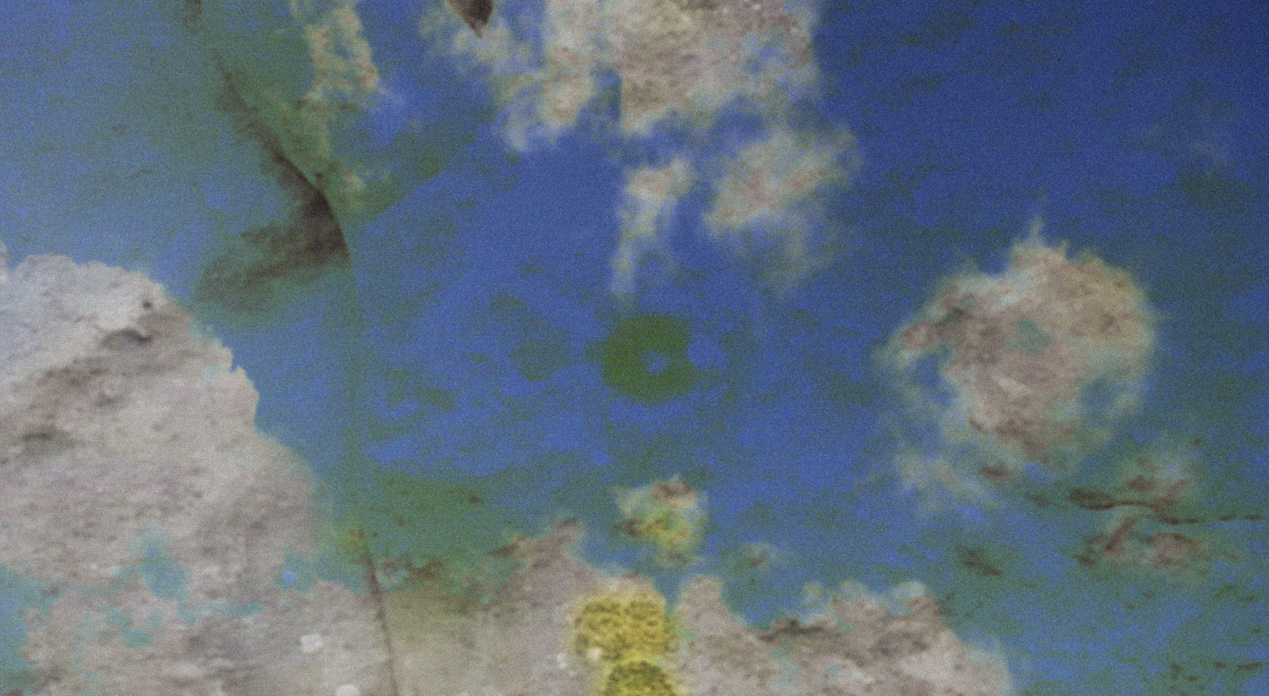
Finn Parrish, Standing Stones Triptych
Introduction The intersection between traditional image-making practices and the advent of artificial intelligence has ignited significant discourse, particularly regarding the continued relevance of human creativity in an increasingly automated world. In the academic year 2024-2025, Level 5 Graphic Design students engaged in an interdisciplinary exploration of image-making, titled Ways of Seeing, led by Zula Rabikowska. This course examined how creative freedom, the process over the outcome, and the human dimension of image-making remain central to contemporary art practices. Students explored the growing tension between human-generated imagery and AI-driven processes, emphasising the sustained significance and power of human craftsmanship in modern visual culture.
Defining “Good Images” A central theme within the discussions was the evolving definition of the ‘image maker.’ In the context of AI’s increasing prominence, students debated the role of human creativity in image production, asserting that qualities—such as authenticity, storytelling, and emotional connection—remain indispensable. While AI can generate images efficiently, it lacks the intrinsic human elements that imbue imagery with meaning. This distinction between human-driven creativity and AI’s procedural generation of images prompted students to reflect on the essence of image-making, a process which not merely concerned with the final visual output but with experimentation, and conceptual foundations that confer value upon an image.
Finn Parrish, Standing Stones Triptych
Human-Made Imagery It seems that AI can recycle and reconfigure existing content, it is incapable of generating entirely novel ideas or meaningful innovations. The uniqueness of human-created imagery lies in its capacity to communicate authentic experiences and stories—elements AI cannot replicate. As students navigated the rapidly changing landscape of image-making, they recognised that while AI tools may serve as useful instruments in certain contexts, they cannot replace the nuanced artistic judgment and emotional depth characteristic of human creators. The process of image creation—learning through failure, experimentation, and conceptualisation—remains fundamental to the artistic journey, underscoring the importance of human input in visual storytelling.
Outcome vs Process In an interconnected global landscape inundated with images, the creative process itself can become the outcome, offering valuable insights into personal growth and artistic expression. A key discussion point revolved around the role of the polished outcome in relation to the process that shapes image-making. While the final product holds significance, the learning derived from the process itself is often of greater value. Experimentation, failure, and the continual reevaluation of ideas are essential in the creation of meaningful imagery. Image-making, thus, should be seen as a journey, wherein exploration and conceptual development take precedence over the production of polished or predictable visuals.
Finn Parrish, Standing Stones Triptych
Healing Through Image-Making Image-making has also been shown to influence emotional well-being and foster personal growth. One student shared a personal narrative of healing following the loss of a dream to pursue a career as a choreographer, finding solace in photography as a medium for self-expression. The project, Ways of Seeing, provided a space for vulnerability and personal discovery, highlighting the therapeutic potential of creative practices in processing emotions and life experiences—something that AI generation cannot offer. For many, image-making served as a personal platform for growth and exploration, reflecting the human capacity for introspection and emotional resilience.
Personal and Professional Growth The project timeline facilitated a deeper exploration and refinement of ideas, providing an environment in which students could continuously evolve their concepts. This flexibility enabled some students to uncover new passions, such as integrating photography with music and fashion, while others found fulfilment in focusing on the conceptual aspects of image-making. Several students expressed an interest in pursuing photography as their primary career, while others explored how combining graphic design with photography could create a more versatile and sustainable income stream. The interdisciplinary approach also inspired students to consider non-traditional creative roles, such as blending photography with music or fashion. This holistic perspective on image-making encouraged students to pursue conceptual and research-driven creative projects in the future.
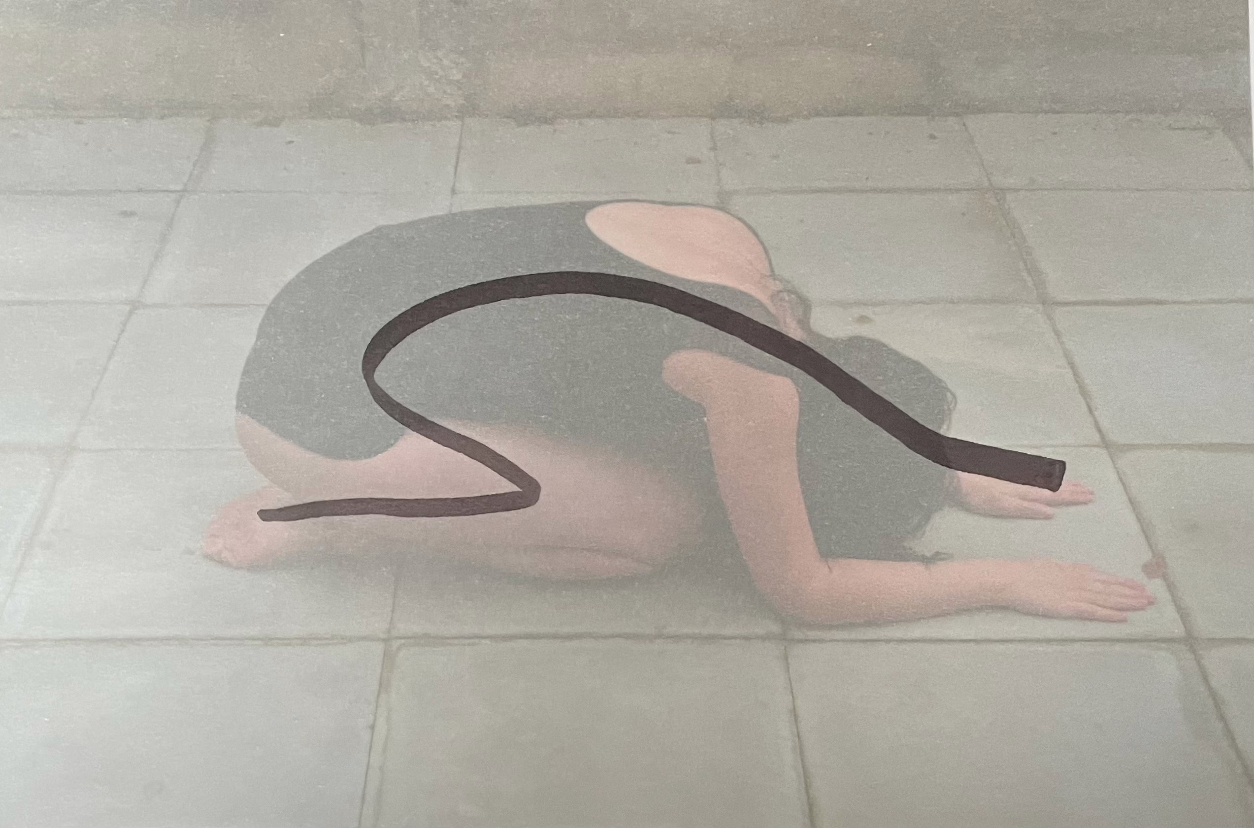
Sophie Adams, Bones
The Power of Images to Change the World The conversation also turned to the transformative power of images in shaping perceptions and documenting reality. Many students concurred that images, more so than words, have the potential to evoke profound emotional responses and foster connections between individuals. While the authenticity of images remains a critical consideration, students acknowledged that images possess immense potential to effect change in the world, both positively and negatively. The ability of images to document realities, challenge dominant narratives, and communicate complex ideas remains a vital force, making human-generated imagery indispensable in contemporary society.
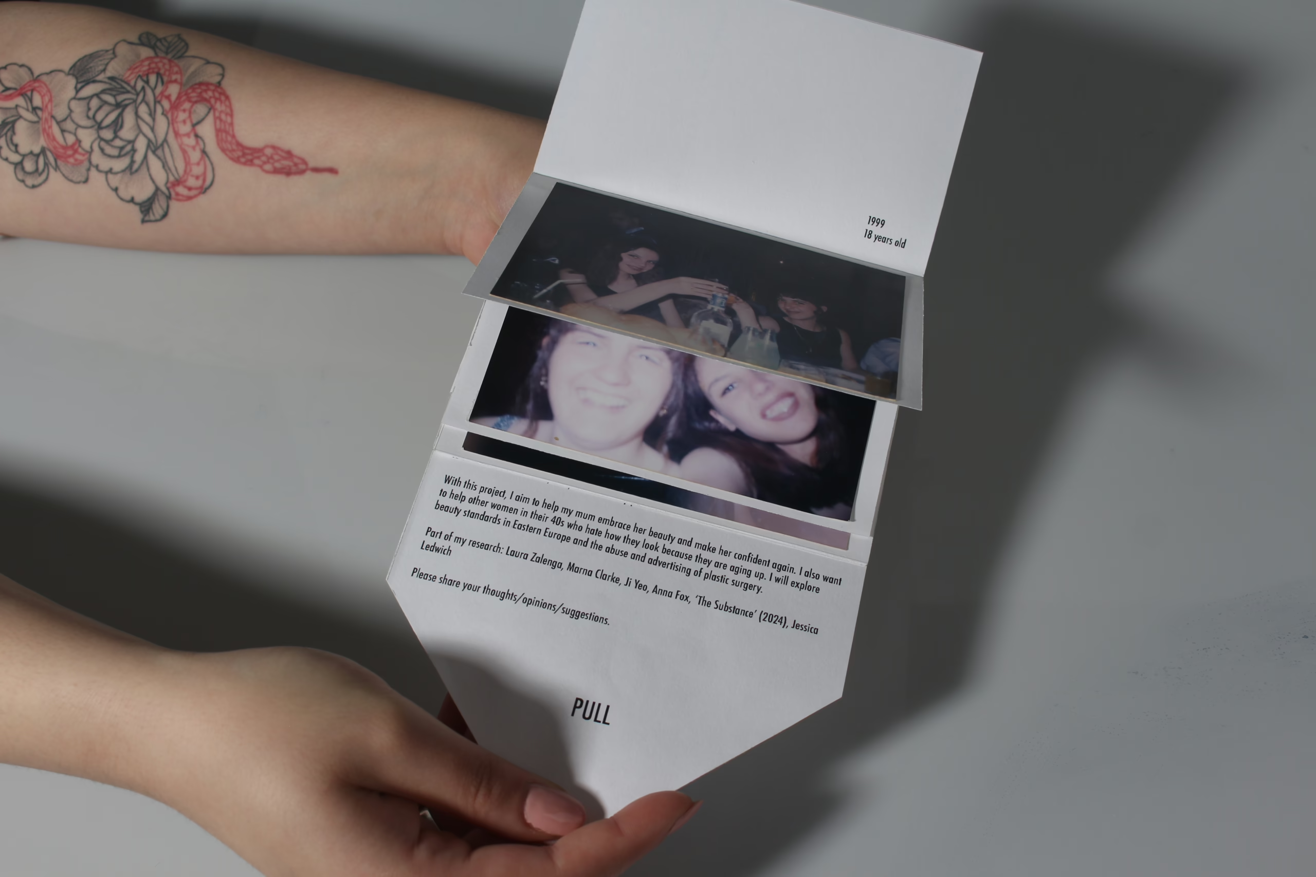
Mona Dimitrova, Beauty (3)
Conclusion The discussions with students underscored the enduring relevance of human-made imagery in an era dominated by AI. While AI-generated images offer efficiency and convenience, human creativity, process, and storytelling remain central to impactful image-making. Through their experiences, students developed a deeper appreciation for the importance of authenticity, experimentation, and personal growth in their creative practices. This process reaffirmed the power of images to influence perceptions, communicate stories, and shape the world.
Zula Rabikowska
I am a queer migrant visual artist and academic based in London. I was born in Poland, grew up in the UK and my documentary practice is influenced by my own experience of migration. In my work and research, I explore themes of displacement, gender identity and LGBTQI+ communities. I have always been interested in storytelling and I obtained a BA in English Literature in French and an MRes in Postcolonial French literature from the University of Warwick. I also hold an MA in Photojournalism and Documentary Photography from London College of Communication.
I work with multimedia, film and digital and analogue photography, and incorporate archival images and documents to challenge conventional visual story-telling norms. My work has been exhibited and published internationally. I won the AOP Talent Award and the PDN Award, and am a recipient of the MEAD Fellowship and Getty Images Grant which have enabled me to document contemporary gender identity in Eastern Europe.
I co-founded the Red Zenith Collective, a platform for womxn and non-binary creatives from Central and Eastern Europe.
Social Design and Collaboration
Tom Mower
This year the Level 5 Graphic Design students have worked collaboratively with the Fashion Design students as a means to research and respond to questions of sustainability. The research and projects have looked at themes concerning materials in design, design and production, community and social justice and environmental impact.
The United Repair Centre addresses a material concern as well as one of equal opportunities and the conditions of labour. Kingston 2025 in part looks to explore the past, present and future of its communities.
Graphic design practice is often understood as a highly collaborative practice. In her opening address at the Design for Planet confrerence 2023, design council director Minnie Moll suggested:
‘The challenge of climate change is so huge we are only going to make the impact we need to if we collaborate, not just with other designers but collaborating with different disciplines, science, technology, business, artists and storytellers. When facing a challenge like this collaborating across all disciplines putting competition aside we do better together, we go faster together, we shout louder together and we can be more inclusive and equitable when we work together.’
Within the Social Strand the students developed research-led projects that enquired into questions of design and sustainability, looking at both the effects of different graphic languages and also how we can use graphic design as a means to communicate messages and narratives.
At the end of theSocial Strand Aaron Deacon Sanchez, Abi Wright, Louis Ashworth, Martha Rutherfoord-Jones, and Tom Mower had a discussion to explore our thoughts and reflections on the value of collaborative or interdisciplinary practice as a model for addressing questions of sustainability. What follows is an edited version of that conversation.
Tom: As an extension of your research this year – if you could go on to work with any other discipline, specialist, maker, community who would it be and why?
Aaron: I would be interested to work with a filmmaker or philosopher, to further develop my approach to film making and the content within my work.
Martha: This year in one of my collaborative projects with Fashion, we wanted to create an eduction project on water quality and the rich cultural and historical significance of rivers. We wanted this to be for a younger audience – but would have really wanted to work with young people within schools and youth groups to develop our research and approach. We did get to work with a local historian whose knowledge and insights on rivers really helped to inform the project.
Abi: I’d like to take my project on natures patterns to a park – having developed it in book form, I’d like to see how it would translate into a workshop for a park community. I’ve started to work with Knowle Park in Cranleigh with this in mind.
Tom: Collaboration provides a platform for knowledge exchange, what did you learn from each other (graphics/fashion/community/audience)?
Louis: In different design disciplines the design process is quite different, and through working with other disciplines this year we have gained this perspective. It makes you reflect on your own design process. Collaboration also let to ways of working I hadn’t considered, fashion designs tend to make use of drawing and sketching – this became material for me as a graphic design to start to interpret as a poster design.
Martha: It reminded my of how digital graphic practice has become, as when working with fashion there was a lot more analogue material exploration involved in the design process.
Tom: Are there particular studios, projects or designers that you found valuable as examples of collaborative design practice/working with communities, uses, audiences?
Martha: A project called ‘Questions?’ by the students of HfG Karlsruhe invited students to interview and respond to the work of guest lecturers as a way of further understanding their practice. These interviews were then designed and collated into a single volume. For me this was a key reference for my work when working with interviews within my own project. I particularly appreciated the use of only two colours, yellow and pink to divide the book into 2 parts. It was also a super collaborative project.
Abi: When researching circularity in design I came across Stella McCartney’s approach of working closely with scientists to reduce the use of harmful plastics within her collections. Whilst this is progressive in terms of material innovation and sustainability I still think cost is an issue as her designs are still relatively expense and not accessible to the general consumer.
Tom: FoilCo gave a presentation this year on their products. They spoke about developing recyclable Foils that break down during the recycling process in the same way that papers do. When we visited Impress they spoke about the developments they have made recently within sustainable print. I was struck by the developments in digital print and waste reduction and also the advancement in print material for outdoor graphics becoming more recyclable and biodegradable. Also, whilst not an area we tend to focus on but is a significant contributor to the carbon footprint of print – behind the scenes they had also quietly moved to a fleet of electric vehicles and utilised their roof space for solar panels.
Martha: Nopla created a packaging material made out of seaweed. I discovered this during my research into materials and my proposal for a materials library. A proposal I want to revisit at some stage in the future.
Tom: During the year you have explored and developed visual languages in response to different conditions of accessibility, sustainability be it environment, material, or semiotic. How would you describe your decision making process and the graphic languages you have developed?
Louis: I found personally a lot of my research was trying to explore alternative graphic and typographic forms for those that we classically associate with mental health and wellbeing. I didn’t want audiences to be put off or feel that it wasn’t for them by the presentation of the subject/service.
Martha: For me it wasn’t so much a question of visual but written language. I was interviewing women about quite personal topics, to create an openness within the dialogue I decided to only use people’s first names in the resulting publication that recorded these conversations. I felt this was a small but significant action within the project. It’s an important topic to talk about but I didn’t want to expose people in a way that made them feel uncomfortable. As an editor I also gave people the opportunity to see and edit the transcript before publishing.
Tom: This is a great point, thank you for sharing that. I guess you have now prompted me to build those approaches into the transcription of this conversation.
The Social Design strand, is conceived as a space to support design enquiry located around a shared and common interest in design, society and sustainability. We come together to consider how people and planet can both flourish in times that present a threat to both. Information, storytelling, identity and exhibition design all form part of both our means of communication as well as practices for critical thinking. When we design, perhaps we should all follow the principle of wanting to ‘leave the planet a little better than how we found it’.
References
Common-knowledge commonknowledge.coop Centre for Urban Pedagogy welcometocup.org FoilCo www.foilco.com Impress www.impressprint.co.uk Kellenberger-White, Exhibition design for ‘Hand and Machine’, Nasjonalmuseet, Oslo kellenberger-white.com/project/hand-and-machine-architecture-drawings-2/ Nopla, Shop for nopla(stics) https://nopla.store Questions? www.itsnicethat.com/articles/sereina-rothenberger-david-bennewith-hfg-karlsruhe-questions-looking-for-answers-in-the-middle-of-somewhere-publication-graphic-design-160519
Tom Mower
As an educator, I have enjoyed the opportunity to work and lecture at a number of institutions, using my research interests and practice experiences to inform my approach to my role as an educator.
In my practice as a graphic designer, I’ve sought to use design as a means through which to investigate social and political questions.
Collaborators and clients past and present include: Artist Alison Turnbull, Large Glass gallery, The Manifesto Club, ABAKE, London School of Hygiene & Tropical Medicine, Architecture Association, SE8 Gallery, V&A Museum, De La Warr Pavilion.
Recent projects include: Psyche or, the Butterfly with artist Alison Turnbull, design and communications for Large Glass gallery London, identity and web design for Field Grey uniform design studio.
Work has featured in the exhibition Graphic Design Now in Production (2011), The Great British Citizenship Quiz was reported on in The Times (2007), Attention Please was reported on by The Telegraph (2009). In 2010 I was the recipient of a IASPIS (Swedish Arts Grants) design residency.
Mediatisation
Marcus Leis Allion
Typography understood as the intersection of communication, representation and mediatisation (Leis Allion, 2024).
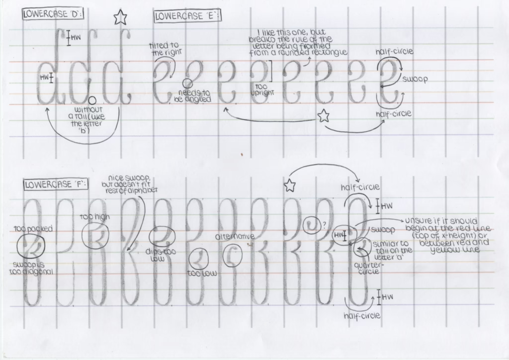
The Mediatisation Strand approached lettering, typography and typeface design as mediums in graphic design. We asked how type operates not just as form, but as medium—shaped by, and shaping, its conditions of production and reception. Building on a rich body of research (formal, technical, historical, media and critical theory) the Mediatisation Strand examined three distinct but overlapping approaches to typography: type ascommunication; type asrepresentation; and type asmediatisation.
Type as Communication focuses on supporting reading by selecting typefaces and setting typography that facilitates engagement with a text, such as in book typography, information graphics, and way-finding.Students investigated how typography mediates meaning and influences perception across different contexts.
Type as Representation emphasises the formal aspects of letters (shape, size, colour) and how they can communicate independently of the sign’s phonetic/textual meaning. It is often used for short texts, such as book covers, movie posters, and logos, to grab attention and appeal to the senses through graphic connotation and iconic signs.
Type as Mediatisation attends to the technical media involved in the production of the design, often transforming utilitarian signs and symbols associated with production into cultural signs and signifiers. This method points towards typography as a medium itself and can be extended to understand how society operates as a mediated construct.
Through this exploration, students have gained a deep understanding of how typography functions as a critical medium in graphic design and how they can direct their practice with both purpose and intent.
What follows is a conversation between Lucia De Francia, Matthew McGann, Poppie Davies and Marcus Leis Allion that took place at the end of the project. The text was transcribed from a recorded dialogue and edited for clarity, flow, and concision. The original voices have been preserved as closely as possible.
Marcus: As you’ll know, I often introduce terms from my research. Has working with the concept of mediatisation shifted how you understand your own practice, or the role of design more broadly?
Poppie: Yeah—it got me to think beyond just flat visuals. To ask, what’s behind the form? What context shaped it? What does it circulate through?
Lucia: It changed how I thought about process. I’ve always struggled with valuing experimentation. But through the strand, I started to realise that it isn’t wasted time. Even the bits that don’t end up in the final outcome still matter.
A page from Lucia De Francia’s sketchbook that show both exploration and appraisal of form.
Marcus: That really comes through in your work, particularly your sketchbook, which is full of detailed developments and annotations. There’s a clear intention that’s explored through drawing. It’s a wonderful object in itself—it reveals the tools and methods behind the outcome.
Lucia: I hadn’t really shown it to anyone before. I was just doing it. But then I realised—oh, this is actually the work. It’s not just prep for something else.
Marcus: And your process shifted, more open, less efficient, maybe, but richer.
Lucia: Yeah. At one point I tried to design every letter using one rule. One system. But some just wouldn’t fit. And you said, ‘sophistication is about supporting difference and complexity over uniformity.’ That changed how I saw it. I needed to loosen the system, let the work develop with some flexibility.
Marcus: There’s value in strict models—but ideals can become totalising if we’re not careful.
Matthew: I see my work as more of a constellation—things pop up, and I just keep collecting them. I’m not too worried about where it’s going. It’s about seeing what happens, then joining the dots.
A constellating approach to developing a project proposal recognises aesthetics and poetics as sights of meaning. Using such a method positions language/writing as one part of the equipment we work with to articulate intention. Photo Lucia De Francia.
Marcus: Much of our work this year unfolded through co-learning—through shared enquiry, informal teaching, unstructured critique. What did you discover through these moments that might not have emerged in more structured settings?
Lucia: The notion of workshops being developed with and co-run by students changed everything. I’d always approached type through calligraphy, but only privately. Sharing that knowledge—making worksheets, talking through tools—made it real in a new way.
Lucia (bottom right) co-running a broad-nib lettering workshop with tutors Marcus Leis Allion and Andrew Haslam.
Matthew: Yeah, we weren’t just following—we were discovering it together. Everyone had something to offer. Different materials, different approaches. That community was important.
Poppie: We did our own Glyphs Application workshop before the taught one. We just opened the software and sat around, clicking things, getting stuck. And then Matty ran off to get Lucia’s worksheets from the calligraphy session. It actually helped.
Matthew: I remember everyone staring at their screens like, ‘What the hell is this?’ And then Ezra jumped in and started showing people how to draw in pixels. We were just figuring it out. That’s what made it stick.
Co-learning became an essential aspect of the Mediatisation Strand. Technical sessions became participatory and contributory making them engaging and enriching experiences.
Marcus: That kind of co-learning builds confidence. It’s folding of a transmission model of communication with a ritual one—it produces knowledge in relation. Is it possible that learning arises less from instruction and more from presence—being with others in a shared space of uncertainty, tools in hand, ideas in motion?
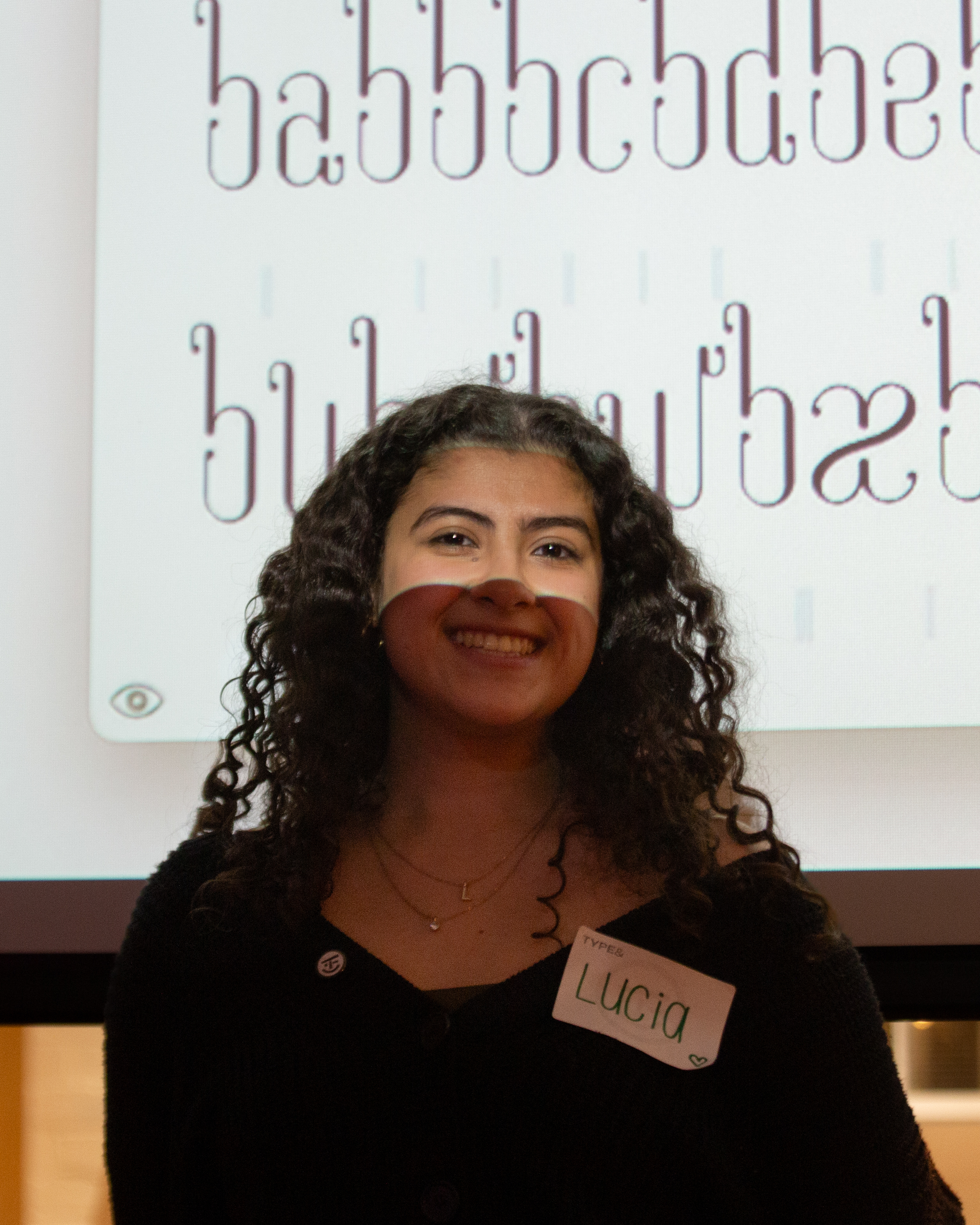
Lucia De Francia at Type & Faces. Photo Gio Isnenghi
Lucia: Yes. It was the same with Type & Faces. I remember thinking: I don’t want it to be a tutor emailing them. I wanted it to be us, saying—we’re students, we’re serious, we’re here. I think that mattered. It changed the dynamic.
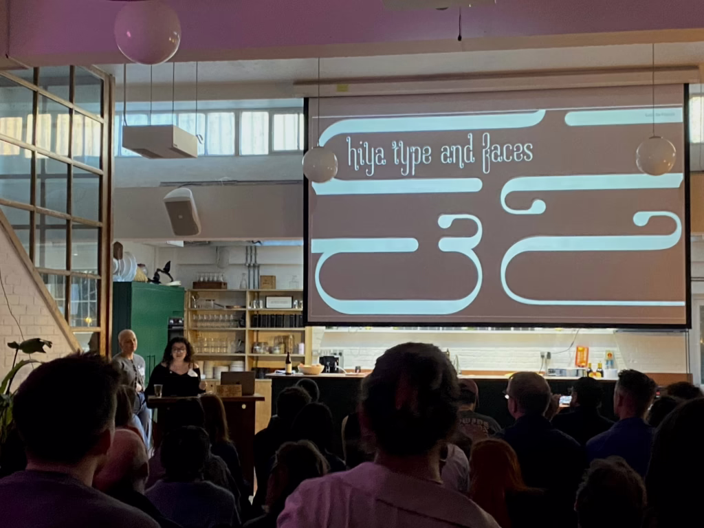
Lucia De Francia presenting her work at Type & Faces, London. Photo Matthew McGann.Poppie Davies and Lucia at Type & Faces. Photo Gio Isnenghi.
Poppie: If Lucia hadn’t invited us, I don’t know if I’d have gone. But because it came from her, it didn’t feel like ‘industry’—it felt like community. And when we got there, we were treated like peers. Not juniors.
Matthew: We showed our work to people in the industry. It wasn’t about being students—it was about being part of a wider conversation.
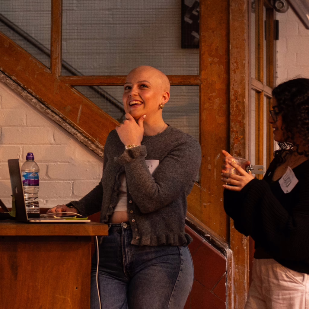
Matthew McGann presenting at Type & Faces. Photo Gio Isnenghi.
Marcus: That was an important initiative that elevated your projects significantly — on your own terms.
Lucia: Yeah—and just being in the room. Showing something and having people respond. I used to think I had to justify everything. Now I trust the work, and let the meaning come later.
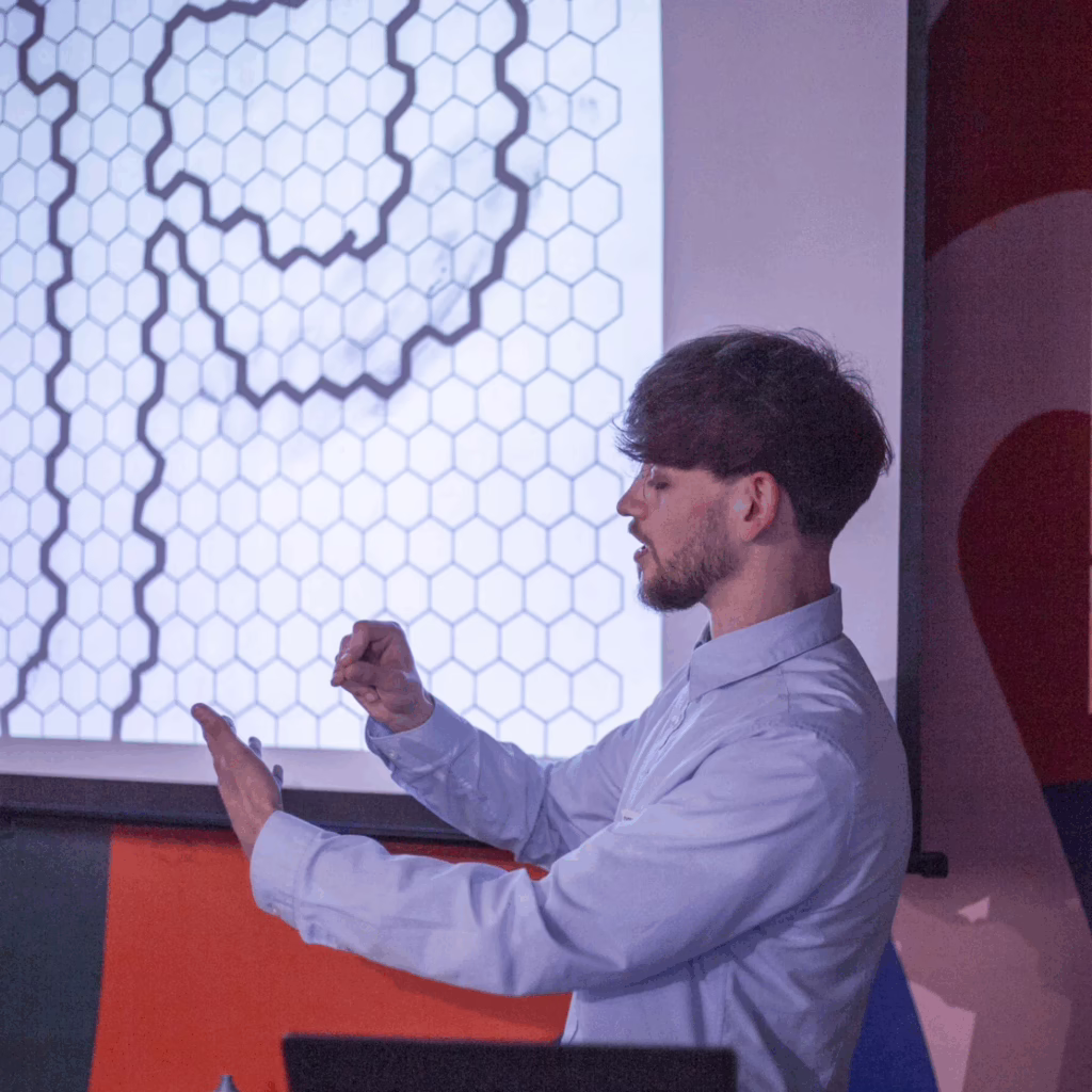
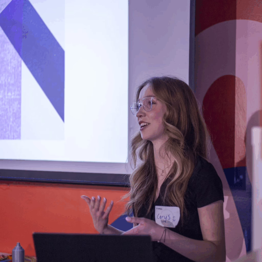
Cerys Fitzpatrick presenting at Type & Face. Photo Gio Isnenghi.
Marcus: We’ve engaged with a number of processes and methods, not only formal and technical, but also paideutic (a mode of learning concerned with formation, reflection, and critical becoming). Do you have thoughts about that?
Matthew: My typeface came from graffiti and community. It’s called Molecule. I was thinking about atoms, and how we come together. In a perfect world, my friends from Salford would be designers—but they’re not. They’re in warehouses, kitchens. So I wanted to show that you can start from anywhere. Use free software, draw it by hand, build something. You don’t have to be rich to do this.
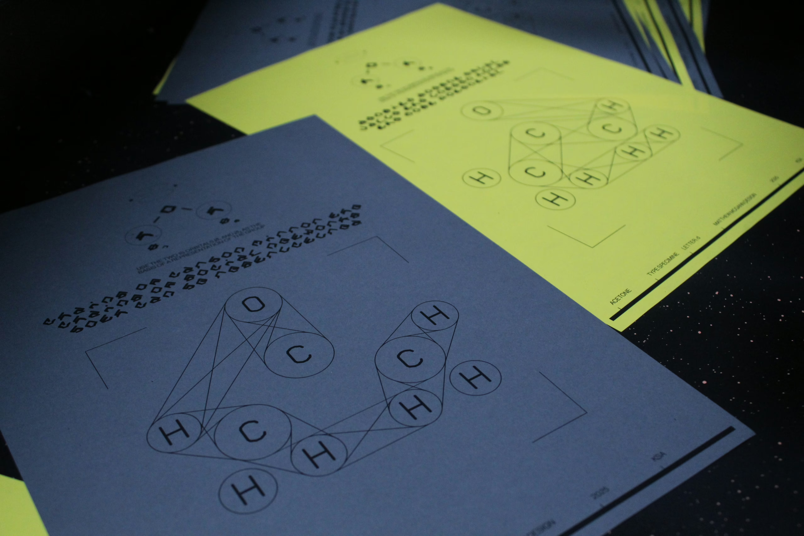
Matthew McGann’s ACETONE Typeface Specimen was informed by graffiti — both as a formal-material practice and an aesthetic of working-class experience. Chemical bonds allude to the construction of connections, the ones we need to make to challenge the atomising tendencies in society.
Marcus:You were visualising your politics—countering atomisation by designing collectivity. And the way you all supported each other this year felt like a version of that. Small bonds forming into something larger.
Matthew: Yeah—and also, at the start of the year, someone in the group was trying to base their typeface on Off-White. I remember thinking, like—it’s too corporate. We can go deeper than that. That was one of the moments where I realised I wanted my work to push back, not just replicate.
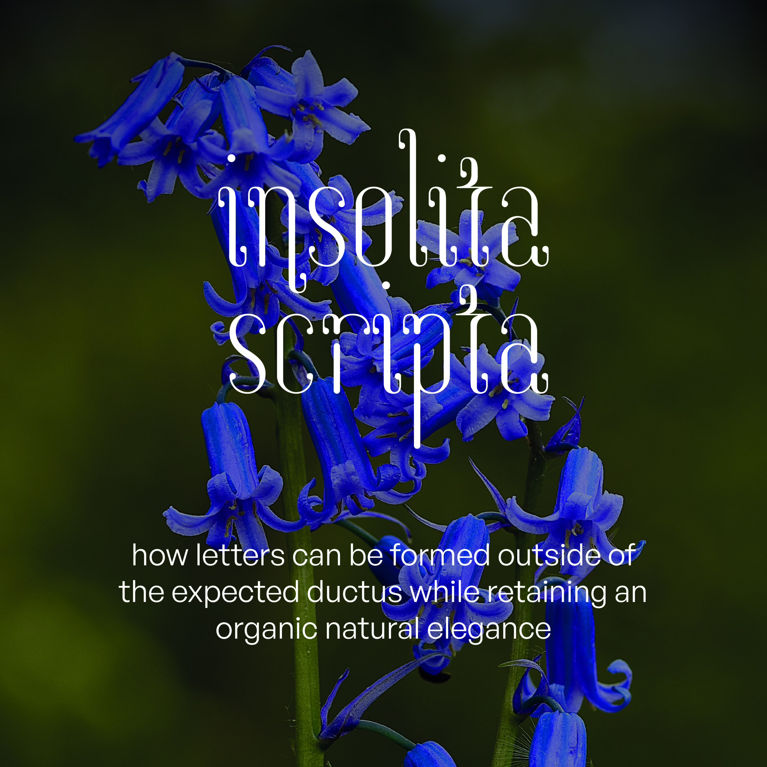
Lucia De Francia’s Insolita Scripta is an elegant typeface that explores the ductus (the stroke order of hand-drawn letters) in a post-digital context. The formal affinity between ball terminals and organic forms informed the designs name.
Lucia: Sometimes it’s more intuitive. I added ball terminals to my typeface because they just felt right. Later, when I looked at the full set, I realised—this looks like bluebells, leading to an investigation into how I could situate my typeface within the language used in botanical studies. It wasn’t planned. But it made sense.
Marcus: That’s often the case I find—form comes first, and then through dialogue with others (either in person or through reading), language helps us articulate our intentions—a dialectic dance of practice and theory.
Lucia: Yes. You follow the instinct. And later, you find the words for what you were doing all along.
Poppie: For me it was Welsh language and feminist publishing history. That started in my IRP, but it shaped everything—my strand project, my Design Studies work. Research and practice are totally interlinked now.
Poppie Davies’ project is a sophisticated entanglement of her research interests: Welsh language, feminism and typographic practice.
Marcus: You each began the year with a proposal—a kind of pre-emptive model of what the work might be. But practice rarely follows a straight line. How did your project shift in relation to that original intent? Do you see your project as closed, complete—or still in motion? What are you carrying forward, not as outcomes, but as ways of thinking or making?
Lucia: Honestly, I forgot my research question halfway through. When I looked back, the work I was creating actually fit. I’d answered my question—but not how I’d expected to.
Poppie: It’s about accepting that there’s no ‘final’ version. Research interests grow. The project keeps unfolding. And that’s OK.
Matthew: I started with experiments—then realised I hadn’t done any research. I went back, found Armin Hofmann, and that clicked with the molecule stuff. Suddenly everything joined up. Like, I’d done it in the wrong order, but it worked.
Marcus: That’s fascinating—especially from a digital media perspective. Your process sounds a bit like a diffusion model: everything happening at once, only beginning to cohere towards the end.
Poppie: Exactly. It’s a process of discovering what the work is really about. And that process doesn’t end here.
Lucia: What I’m taking forward is being more conscious of the people and ideas around me. Not just working in a bubble. Building community, being present, listening.
Matthew: Same. And knowing that you don’t have to be rich or well-connected to do this. Just curious. You can start anywhere. And you don’t have to do it alone. And I want to carry that forward. Keep the connections going. Keep the molecule growing, basically.
Marcus: Exciting. That’s what the Mediatisation Strand sought to model: design as an enquiry into modes and relations of production. Approaching graphic design through research helps us move our practice away from immediacy and instrumental thinking. Thank you all for your time.
The Mediatisation Strand was enriched by the insights of many informed and interesting people, in particular Andrew Haslam; Steven Swinney; Linda Byrne; Anne-Dauphine Borione (aka Daytona Mess); Paul McNeil (MuirMcNeil); Luke Charsley; Addison Copas; Guy Burgess; Min-Young Kim, Ksenya Samarskaya, and Alex Slobzheninov at Inscript; Fred Wiltshire and the team at Type & Faces; as well as the wider course team and student community.
Mediatisation Strand 24/25 was: Annie Liu, Cerys Fitzpatrick, Chloe Chen, Esther Cheung, Ezra Bagheri, James Medcraft, Krisite Pang, Kylie Wong, Lily Clowes, Lucia De Francia, Matthew McGann, Poppie Davies, Rebecca Su, Ying Gao and Marcus Leis Allion.
Marcus Leis Allion
Marcus Leis Allion is a typographer, educator, and researcher. His work spans critical pedagogy, poetics of aesthetics, and the historical materialism of visual culture.