Publishing
In its widest definition, graphic design’s main concern is to make public. Accordingly, our strand understands publishing in its etymological sense as the act of making something public, a holistic activity concerned not only with how something is said (the form), but also with what is being said (the content) and how it is being disseminated (the channel). These are the notions we interrogate and reflect upon, answering with the generation and eventual dissemination of publications, which are not confined to the medium of books but can include a broad range of outcomes such as events, readings, performances and so on. The act of publishing is seen as a means to connect with like-minded individuals and form a community of readers, listeners, enthusiasts and fans who are drawn together by shared interests, each orbiting the site of publication. In this way, publishing – like communication – is a dance; it is a choreographed process of making knowledge public by filtering, amplifying and distributing ideas through existing, emerging or tailor-made networks and channels.

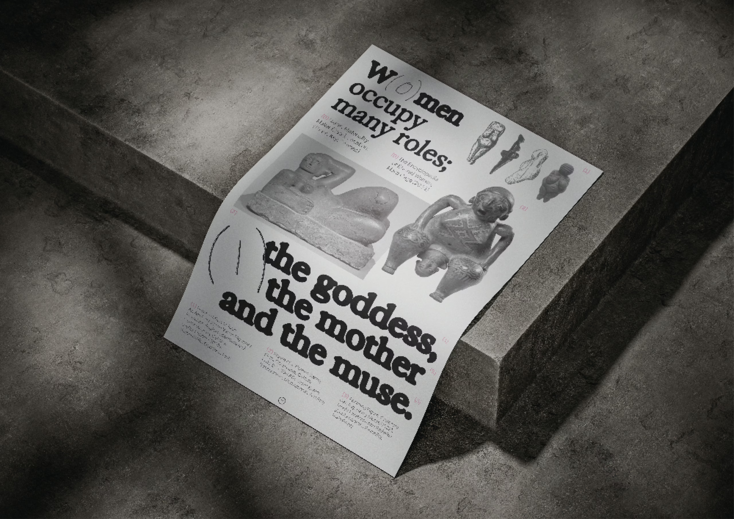
Maya Cage, Goddess,
Mother, Muse. The Encyclopaedia of Eternal Women
In her work, Maya Cage collects and collates sculptures of women to identify gender roles within society, creating an archived encyclopaedia which uses her own referencing style to make its content accessible for academic, educational, and artistic use. For Maya, publishing is not just about the final object: it’s about making something visible and doing so with intention. ‘What I’ve learned from the strand is that making anything public has value,’ she says. ‘If you care about something – no matter how niche – you can make space for it. That in itself is important.’ She emphasises the craft involved: ‘The process taught me to respect images, to think about image pairings, to be finicky with type. Design is in the details.’ Reflecting on the diversity of projects around her, she finds the collective affirmation powerful. ‘Everyone’s pursued their own interests, no matter how specific or unusual. It’s joyful to see that. Publishing becomes a way of celebrating something you care about – and of giving it form.’

Chengyu Gao,
Devour Jordy Food
‘My project began with a sense of dissonance,’ Chengyu Gao explains. ‘I was watching Stephen King’s The Lonesome Death of Jordy Verrill, a horror film with exaggerated, almost absurd performances. The acting felt over the top and became the conceptual core of my work.’ Chengyu reflected on the way King plays with horror tropes – not simply to frighten, but to invite the audience to interpret, to engage actively. ‘Even the smallest characters have impact. That’s where the metaphor of the weed came from: weeds are unwanted, often overlooked, but essential to the ecosystem. King uses them as a stand-in for those at the margins of society.’ She says her early experiments were deliberately unrestrained; she gave herself permission to go too far to figure out what the project wanted to say. Chengyu explored these ideas through layout, binding, and typographic gesture, but also by creating a visual environment. ‘I used the setup of the presentation itself as a storytelling tool. The goal wasn’t to explain everything, but to show a set of ‘vibes’ that bring the audience closer to the project’s emotional landscape.’

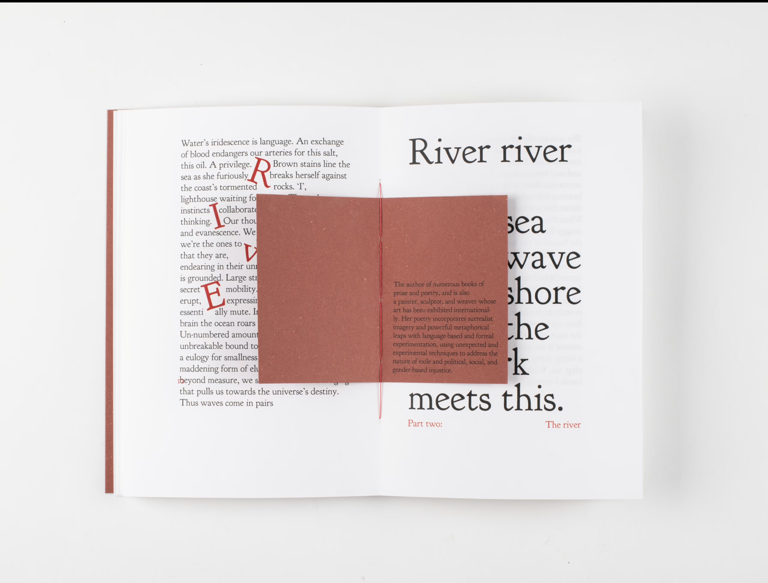
Lola Penston Raja,
Now the author of the glazed water
Lola Penston Raja’s project centres on the Doves typeface, repositioning its story through encounters: with mudlarkers, poets, writers, and curators who each bring a voice to the evolving narrative. Central to her approach was resisting a singular authorship. ‘It felt more honest to bring in other perspectives – to let the story unfold through different people’s interpretations.’ Conversations, site visits, and exhibitions about mudlarking shaped the direction of the project just as much as studio experimentation.
The project expanded well beyond the form of a conventional book and led to producing multiple editions and experimenting with non-digital methods of reproduction. Lola also began curating her own exhibition and engaging with public-facing platforms. ‘It gave the project longevity. I was making work that had a life beyond the module.’ That shift in orientation was transformative, and the ripple effect of these experiences continues. One of the writers she collaborated with – a mudlarker – invited her to contribute to the Secrets of the Thames exhibition. ‘That came directly from learning to see myself as a publisher. The strand didn’t just teach me how to make a book, it gave me the confidence to speak about my work, again and again. And that’s how networks form.’

Capucine Pochet,
My Grandad the Phillumenist
Capucine’s project began with a drawer – four, in fact – containing her grandfather’s extensive matchbox collection. ‘I used this project as a chance to explore not just the collection, but the act of collecting itself. Why do people hold onto things?’ This inquiry echoed her dissertation, which focused on the possessions students bring with them to university. She started by photographing each of the 475 matchboxes. ‘It was overwhelming at first. I tried organising them by country or topic, but those systems clashed. Eventually, I decided to reduce the number to 143 of my favourite matchboxes and group them into more thematic categories.’ The project quickly became a study in structure and editorial decision-making. ‘At first it was about the visual language of the matchboxes, but then it shifted – why had my grandfather collected them? What do these objects mean now?’ That question took on emotional weight, too; her grandfather, who has dementia, no longer engages with the collection in the same way. ‘It became a project about memory – about what happens when someone begins to forget. I think the publication can spark something in others too: a reflection on their own grandparents, their own personal archives.’
Jonas Berthod
I am a researcher and writer currently working as a post-doctoral researcher, lecturer and artistic associate. I co-organise the exhibition Behind the Books in London.
After at BA in graphic design at ECAL/University of Art and Design Lausanne (HES-SO), I graduated with a MA in visual communication from the Royal College of Art and earned a PhD in art history from the University of Bern with a thesis on the impact of cultural promotion on the field of Swiss graphic design.
I previously worked as a graphic designer independently and for studios including Atelier Dyakova, John Morgan studio and Studio Veronica Ditting. I served as a visiting lecturer at several institutions in the United Kingdom and in Switzerland. I held the position of associate researcher on the SNSF project “Swiss Graphic Design and Typography Revisited” (2016–2020) and co-curated the Weltformat Symposium in Lucerne over four years.
Matthew Stuart
Matthew Stuart is a typographer, editor and writer based in the UK. His practice and research interests deal with acts of reading and publishing, language and typography, scripts and transcripts, reconstruction and material remnants, and the voice and the written word. These ideas are channelled through Lazy Machine, an evolving (and revolving) research and pedagogical elective.
He edits and runs the journal and multifarious publishing platform Bricks from the Kiln and works on publishing, editorial and curatorial projects as a designer and researcher, frequently in collaboration with independent publishers, writers, artists, curators, galleries and institutions.
He has exhibited and delivered talks internationally at institutions including The Most Beautiful Swiss Books, MoMa PS1, Mahler & LeWitt Studios London, Scottish National Gallery of Modern Art, Tenderbooks, Umlaut Gallery, Wysing Art Centre, Central Saint Martins, Outpost Gallery, Legion TV, Ox-Bow School of Art, London College of Communication, Graham Foundation for Advanced Studies in the Fine Arts, Royal College of Art, and the International Biennial of Graphic Design in Brno.
www.matthew-stuart.net