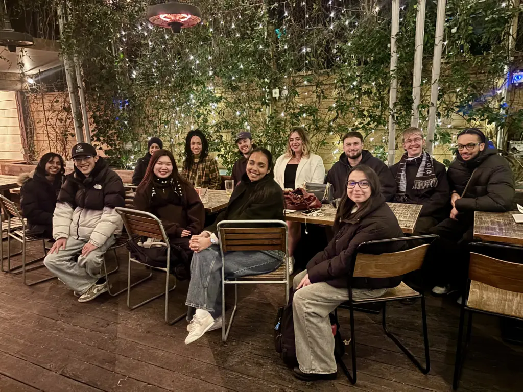
Mediatisation: From Form to Formation
A dialogic re-composition with Aaniyah Khan, Induilaxa ‘Lucky’ Jasiendra and Mengjie Fan
Mediatisation is a typography-focused strand concerned with graphic design as a mediating practice. It examines what form looks like and how form takes shape through material, technical, linguistic, historical and social relations.
It is taught through lectures, prompts, workshops and tutorials. Students also lead workshops and present alongside staff, with field trips and meetings with practitioners and alumni extending these exchanges. Through this activity and the less visible labour of returning to work and revising it, students develop the methods and judgement to pursue self-directed projects.
In contrast to last year, when I recorded an in-person conversation which I then transcribed and edited (see Mediatisation), this year I wanted to consider more explicitly how the mediation of writing itself might support reflection.
When we speak with others, thought unfolds under the conditions of the encounter. Writing introduces a different temporality. We can return to a thought, search for a more precise term, restructure a sentence, revise an earlier formulation or recognise a contradiction that was not initially apparent. These acts are part of the process through which thought takes form and becomes available for further reflection. In this sense, writing seems closer to the iterative character of practice, where understanding develops through processes of making, revising and making again.
The following text therefore takes the form of a dialogic re-composition assembled from process books, reflective reports, project proposals, tutorial exchanges and other documents produced over the year. I have brought statements from different moments into relation through selection and editing, allowing changes in understanding to be examined alongside contradictions that persist.
The text reads the strand through its own material, examining how students developed autonomy through guided practice and their encounters with others. It returns to shifts in project direction and to problems that emerged through making, whose significance often became apparent only as the work developed.
Marcus Leis Allion, 2026
Immediate History
Marcus: At the beginning, what was your understanding of graphic design? Were there particular aesthetic interests, methods or practices that you were keen to pursue?
Aaniyah: I knew I wanted to move past what I had already done. The year before, my typographic practice was focused quite heavily on my own culture and language. I designed an Arabic typeface influenced by Kufic script and by my earlier modular typeface designs. I felt like I had somewhat ‘satiated’ that part of my practice. I still wanted to work with type, but I wasn’t sure what that would look like.
Mengjie: Mine was more that I didn’t really understand typography beyond its functional role. I mainly thought about readability and communication. In one of my first tutorials with you, I recognised that I was interested in composition, space, colour and form, but I also recognised this gap in my understanding of typeface design. I wanted to move from that confusion towards something more structured and informed.
Induilaxa: I was quite new to typography as well. Looking back, I think I only recently recognised that the typography-led video I made in my second year was actually the kind of work I had always wanted to make at university.
Aaniyah: That recognition emerged over time. I noticed that whatever project I researched or experimented with, I approached it typographically. Sometimes that meant designing a typeface, sometimes a typographic identity. It felt intuitive, but I only realised it after seeing my work over an extended period.
Marcus: Fascinating. You used visual research and analysis to examine your own work, making a hidden pattern of practice available for reflection. Were there other moments when you began to change how you understood typography itself?
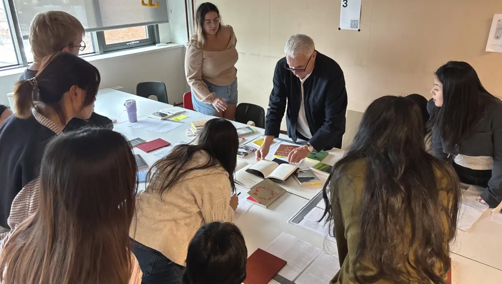
Mengjie: After Andrew Haslam’s presentation, The Typography of Poetry, I started thinking differently about what type could do. Layout, spacing and hierarchy were affecting not just reading but emotion as well. It moved typography from being a carrier of content to something active in meaning-making.
Marcus: Typography was shown to be both communicative and representational.
Aaniyah: Atypography had a similar impact on me. I couldn’t really get it out of my mind. I was interested in the limitations of traditional writing and this idea that you engage with form as a part of reading rather than understanding it immediately. What fascinated me was that it was an art movement, not a design movement. It looked like it was playing with typography, but it was actually trying to do something else. That is really where my research interests started.
Marcus: Yes, that’s a helpful reference. Typography is no longer simply organising writing for communication—its conventions become things that can themselves be investigated
Induilaxa: That difference between the way something looks and where it comes from became important for me with cybersigilism. I was interested in the style, but wanted to become more knowledgeable about its origins. Once I started looking at its history and how it had been re-contextualised, there was more to investigate than the visual language alone.
Making Expands the Possible
Marcus: We were exploring was how typography could function as a carrier of meaning but also as a medium shaping perception. What happened when you pursued that question through making?
Mengjie: At first I relied a lot on intuition. In one of your workshops, I made letterforms visually before redrawing them using the proportions of existing typefaces. The first version looked visually acceptable to me, but it wasn’t structurally consistent. The underlying structures helped me understand proportion, spacing and alignment differently.
Induilaxa: I actually found constraints helpful too. In Diya and Aaniyah’s student-led workshop, I had to think about what happened to my typeface as it became increasingly smaller. I could keep the overall shape, but I had to remove the finer details. Without those intricate strokes and textures it started looking flat and lumpy. It made me realise in previous projects I’ve felt overwhelmed when there were too many choices. So I devised clear parameters for developing my project.
Aaniyah: That workshop was useful for me for a different reason. Diya and I were asking other people to sketch and physically interact with letterforms, based on the workshop we had experienced at TypoCircle’s SuperCondensed. As I tend to stay in the digital space, it was strange being the person teaching the importance of physically making while also learning it myself through the students.
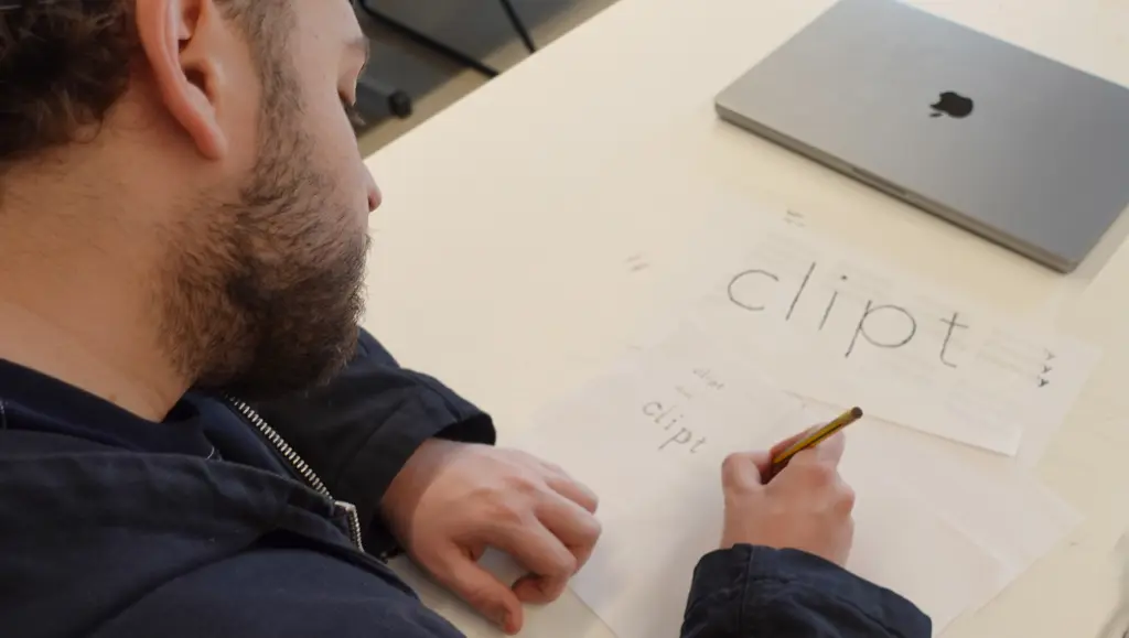
Marcus: Your workshop put the notion of plasticity—as form-giving and form-taking—into practice!
Mengjie: I think the physical part changed things for me also. After talking with you, I shifted from a focus on ideas to experimentation and making. I started creating letterforms with masking tape—that introduced transparency, overlap and interaction. Typography stopped being just the shape itself and became affected by material and colour.
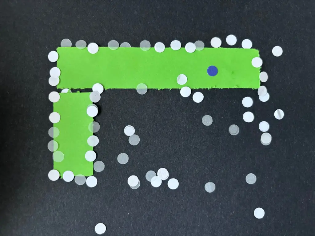
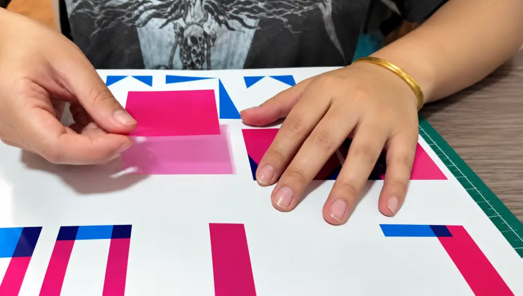
Aaniyah: I came to that understanding much later. I realised I still hadn’t moved outside the digital space enough. I took hole-punched paper from the studio and used it as physical particles. They were small and I couldn’t align them properly, but the lack of control was what actually made them feel like particles. The paper was behaving in a way I hadn’t planned.
Marcus: Might we say that making with equipment experienced in its immediacy helps us explore and discover possibilities that production equipment can inhibit.
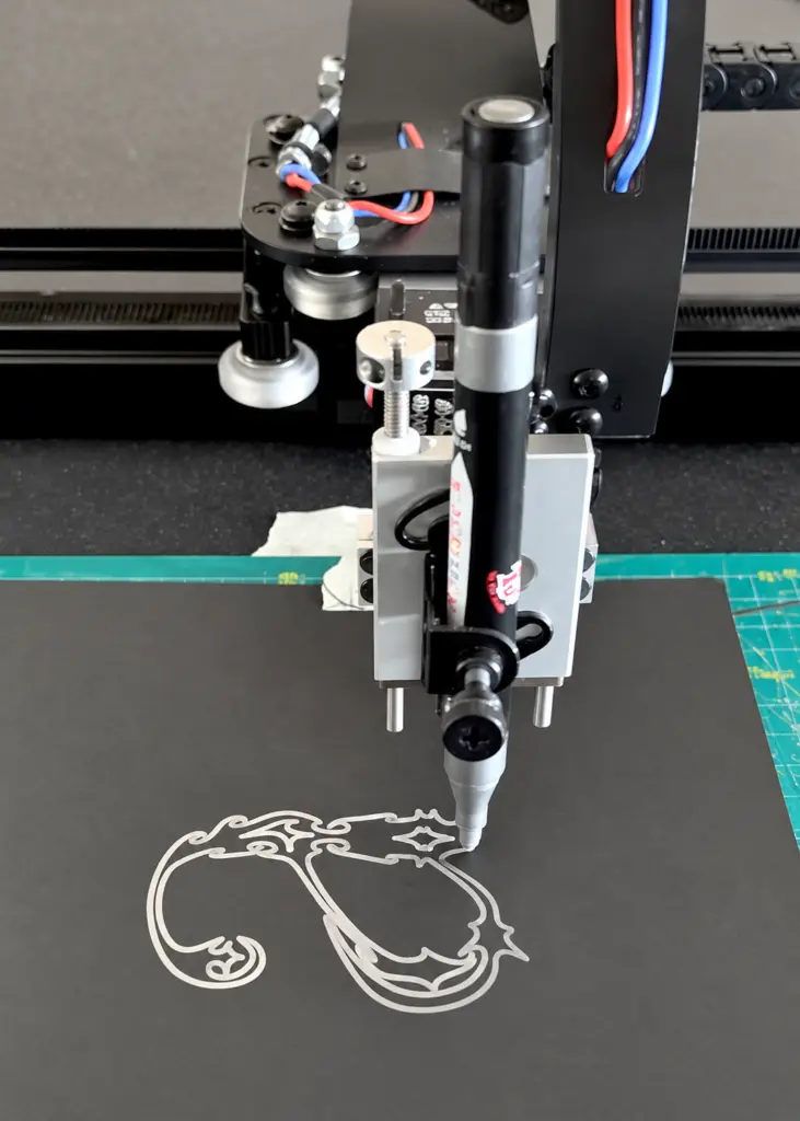
Induilaxa: With the pen plotter, I tried different pens and different types of paper. The thicker pens didn’t work because they reduced the sharpness of the edges. But the overlapping letters started resembling the layering of graffiti tags—there was something intriguing in that.
Aaniyah: I wanted to make the animation physically before I made it digitally. I moved the paper particles in fpuncand out of the forms to understand what the later digital animation could become. So it wasn’t really physical versus digital. The physical experiment was helping me think about the digital one.
Marcus: Yes, we should avoid any simple division between ‘digital’ and ‘analogue’, as the distinction obscures how different materials and technologies condition what can be done. Different equipment affords different kinds of practice. Practice can work with those affordances, adapt them or work against them.
Mengjie: Yes, my process worked across different media. I looked at dragon-scale binding and tested repetition physically first, then moved it into Illustrator where I could control it more. I realised layering could structure time and sequence, not just create an effect. That helped me avoid getting stuck.
Working Through Limits
Aaniyah: I had a point where I was stuck. I had started applying particle elements to an existing base typeface, Mekon, but it didn’t really excite me. It helped me visualise something, but I knew I could push it further.
Mengjie: I had a similar experience to that with the grid. At first it helped because it gave me structure. Then I realised it was also restricting the more experimental possibilities, so I went back to drawing without it. I think that was when I understood there was this tension between structured systems and intuitive exploration rather than one being automatically better.
Induilaxa: I think I did too much before I realised I could reduce the problem. I spent a lot of time making full character sets, and eventually that wasn’t what I needed. Once I worked with a single glyph, the project moved much faster because I could make something and critique it more quickly.
Marcus: What did reducing it to one letter make visible?
Induilaxa: I had to stay inside the boundary—which sounds restrictive—but it meant I could concentrate on the graphic language i was interested in.
Aaniyah: I went back to this idea of the atom as a structure. Instead of illustrating it literally, I started building forms around this ‘perfect’ sequence. At some point I stopped thinking of the forms as simply unreadable and started asking whether another set of forms could help inform the first ones. Suddenly the project had a clearer direction.
Mengjie: That sounds a bit like what happened when I realised different letters needed different approaches. I tried transforming the word ‘XIAN’, the name of my hometown, but the ‘X’ was difficult because of its structure. It showed me that I couldn’t just apply the same operation to everything.
Aaniyah: I kept doing that with legibility as well. I would make something experimental and then immediately ask myself if I could still read it. Eventually I realised that wasn’t actually the point of the typeface. But I still compromised a little by putting the names of the forms in the specimen. It was difficult to get over that assumption.
Induilaxa: I don’t think legibility has to be all or nothing either. I was looking at work where reduced readability becomes part of the meaning. I didn’t want the typeface to be entirely illegible. I wanted the poster to reduce legibility through abstraction.
Mengjie: My work moved away from readability as well. In the posters, the text gradually stopped functioning as a carrier of meaning and started becoming more like a shape in the composition. That was quite an important shift for me.
Working Alone With Others
Aaniyah: A lot of the year changed because of our meeting with people outside the course. I got involved the guest speaker series and contacted Andreion De Castro and Fanny Hamelin. It was completely new for me. I was suddenly in this active position, it gave me much more confidence and helped me define and develop my practice.
Induilaxa: Conversations became part of the research for me too. Anne-Dauphine Borione’s (Daytona Mess) gave insightful feedback and suggested things like testing different stroke widths. That gave me something specific to work on.
Mengjie: Mine was often much more informal. I showed the work to my peers and talked through it with them. They noticed things I had overlooked, but I also learned by seeing how they approached their own processes. It helped me become more critical about my own methods.
Aaniyah: Presenting my work did that too. Sharing the process out loud made me realise I wasn’t really designing one typeface. There were two typographic languages, and one was helping me understand the other. Then, listening to everyone else present, I realised we were all working with systems, but the systems looked completely different depending on the project.
Induilaxa: Research changed my relationship to the visual style too. I was initially very caught up in cybersigilism as a trend and I think I assumed trends were automatically negative. I came to think that styles shouldn’t be gatekept, but if you use them you still need to understand their cultural and historical context.
Marcus: And the history wasn’t separate from the form. Your research into cybersigilism, graffiti and tattooing changed what you were making, not only what you were saying about it.
Induilaxa: Exactly. I started looking at the fading of tattoos and the layers within graffiti rather than just taking them at surface level. Conversations pushed the project much further.
Mengjie: I also realised I wasn’t being influenced by one individual artist as much as I thought. It was more the accumulation of research and methods. My process became more structured through iteration, critique and re-evaluation. I still wanted experimentation, but I was becoming more analytical about why I was making decisions.
Aaniyah: Talking to practitioners changed the way I thought about process too. I started understanding that there isn’t one design process. Everyone develops their own. That was reassuring because I could see my own testing and questioning as a process rather than just me not knowing where I was going.
Matter Makes a Difference
Mengjie: The final review made me rethink the work physically again. I had been trying to create space through colour and layering, but the spatial effect still wasn’t strong enough. The feedback was to experiment with card and three-dimensional forms. Once I did that, I could actually test how the elements interacted in space rather than only simulating depth on screen.
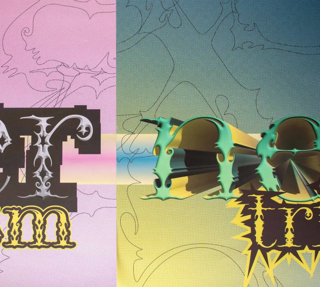
Induilaxa: I was moving between contexts too—music, graffiti, tattoos. Because the deadline was close, I mocked up the type as tattoos before actually making temporary tattoos. The typeface didn’t work at a small scale, so I extracted shapes from the letterforms instead.
Aaniyah: My final specimen came out of the physical experiments as well. Seeing transparent paper made me think about using layout paper so the forms could literally sit over each other. I tested the translucency and made an A5 mock-up because I felt a larger format would become overwhelming. I also realised some of the trace forms had to be printed reflected so that the pages would align.
Induilaxa: I made the type specimen into a tattoo flash book, using polypropylene fabric for the cover because it is a synthetic plastic-based material associated with fast fashion, which connected back to the way cybersigilism had been absorbed into that context.
Mengjie: My colour experiments kept changing too. At one stage I realised I was using colour in a repetitive way, so I started researching traditional Chinese colour systems. The palette became softer and more balanced compared with the earlier high-contrast experiments. It gave me another way to think about relationships between colour, history, culture and research.
Practice (in)forms Reflection (in)forms Practice
Aaniyah: I think taking the work into public situations changed me as much as the project did. Presenting at Type&Faces with Diya felt like the whole year had been leading towards it—going to networking events, arranging guest lectures, presenting workshop research. I was nervous because I was speaking to a room of established creatives, but answering their questions made me think about my own process differently.
Induilaxa: I had a similar thing with public speaking. Hosting Tamil Heritage Month on stage to a large audience meant I had to be more deliberate and intentional in the way I communicated. Preparing for Type&Faces also made me think about how to turn a process-led, research-driven project into something concise enough for someone else to understand.
Aaniyah: Before this year, I saw myself as someone who made cool type. Now I think it is more about experimenting with and testing the conditions of typographic form.
Mengjie: Mine has shifted from thinking about colour and typography separately to seeing them as part of the same spatial system.
Marcus: So we might note that a rich array of research methods was valuable, as it made aspects of our work available for reflection that were initially difficult to recognise or articulate.
Mengjie: Yes! While the process is structured, the outcome can still change. I usually start with textual and contextual research, then visual analysis and experimentation, but I rely on iteration, critique and re-evaluation. I don’t really want to follow a fixed outcome anymore.
Induilaxa: I do think clarity at the beginning helps me, but it isn’t something you establish once. In other projects I would ask whether an experiment was showing the viewer what I wanted them to see. So the intention itself had to be continually evaluated and refined.
Aaniyah: I started with a general idea of a modular typeface. By the end, I was thinking about forms informing forms and language informing language. Even that terminology would have confused me at the beginning. The biggest change was probably interacting with materiality. I regret not pushing that further, maybe through another workshop centred on the relational typeface.
Induilaxa: I would definitely change how I manage the time. Restarting my project disrupted everything else, and I could see the effect on my other projects. I recovered, but I still need a way of planning that can deal with unexpected changes without compromising the other outcomes.
Mengjie: I still think mine needs more refinement as well. The spatial system is clearer now, but the visual hierarchy isn’t completely resolved. I want to balance the complexity with readability without losing the idea that type can operate as a spatial and visual form.
Aaniyah: I think I’m more comfortable with that now—the project not being completely finished. I started the strand not imagining I would be someone who raises their hand to volunteer, presents findings, or starts conversations with practitioners. I also
Marcus: Those are really interesting insights. You each have become less focussed on the acquisition of knowledge than the development of a capacity to engage in research and reflect on what you were doing and act differently as a consequence. That is something you can continue to develop as your practice evolves.
Developed and taught by Marcus Leis Allion, the Mediatisation Strand (2025–26) explored the relationship between graphic design, technology and history. Informed by Hegelian dialectics and Catherine Malabou’s concept of plasticity—the capacity to receive, give and transform form—the strand approached design as a practice that both shapes and is shaped by the world around it. Through critical inquiry and experimentation, students explored how form, material, technology and purpose could be negotiated and transformed.The work that followed emerged through the thinking, experimentation and contributions of the 2025/26 cohort: Will Aggett, Samiya Bashaeb, George Cavaliere, Mona Dimitrova, Mengjie Fan, Induilaxa ‘Lucky’ Jasiendra, Aaniyah Khan, Charlotte Lim, Ruixue Qiao, Diya Santhosh, Han-Jo Tan, Tianyue Zhang, Steven ‘absolutely tremendous’ Zhou.
Along the way, many others contributed their time, knowledge and support, including: Addison Copas (Alum); Alice Twemlow; Andreion De Castro; Andrew Haslam; Becca Whitening and Finley Shove (Regular Practice/Alum); Chris Nott and Connie Wemyss (Studio DRAMA); Daniel Roberts (Alum); Fred Wiltshire and the team at Type&Faces; Jack Llewellyn (Pentagram/Alum); Jack Niblett (Alum); Jeremy Leslie (MagCulture); Ke Hu (Alum); Lucia De Francia (Alum); Mariam Asfor (Alum); Fanny Hamelin and Leo Guibert (Nan Foundry); Quba Brown-Higgins (Alum); as well as the wider course team and student community.